Plotting the simulation results
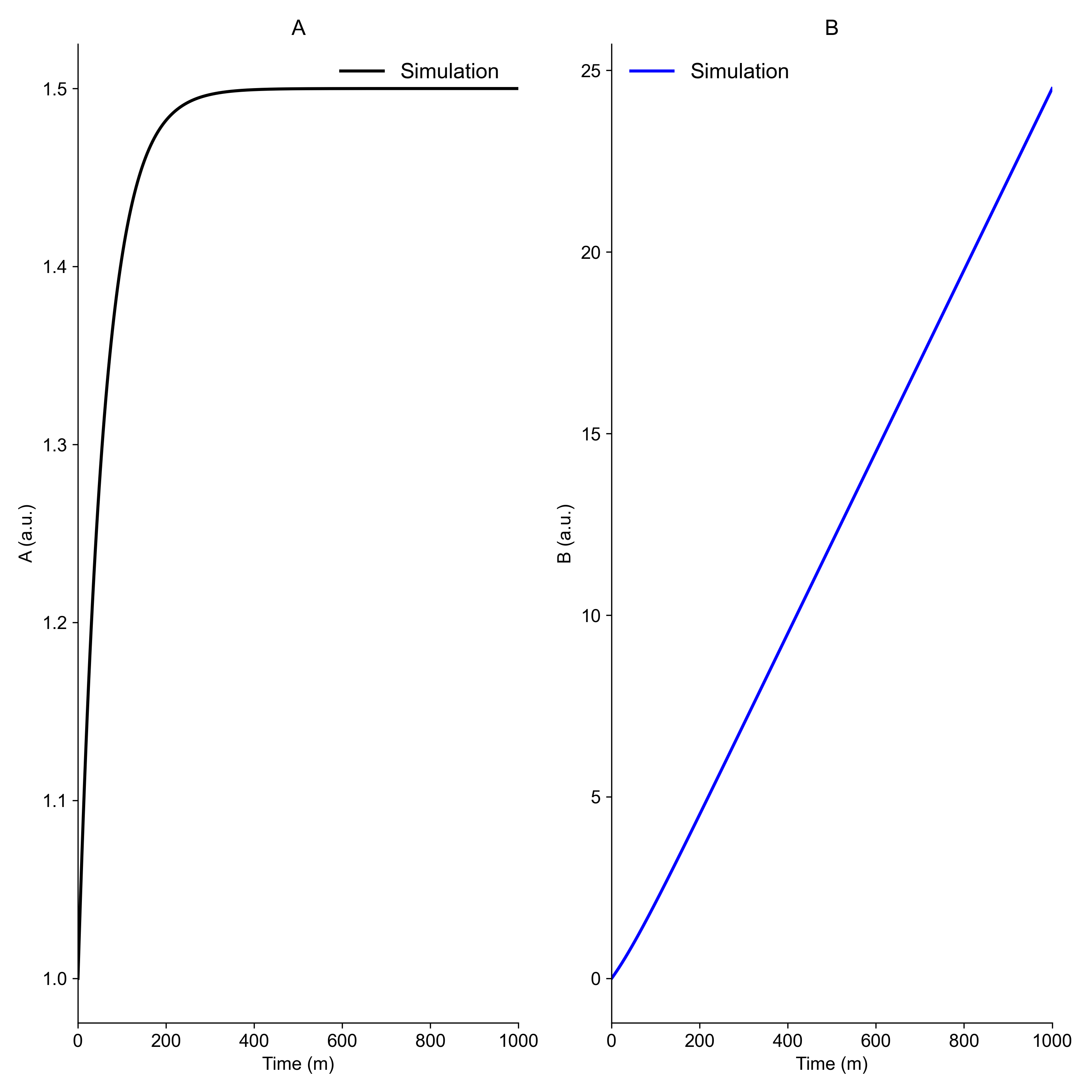
To observe the simulation results and investigate the model behaviour, it is typically a good idea to plot the simulation results. In this example, we use matplotlib and a simple model (given below) to generate the following figure:
The model
In this example, we used this model, saved as minimal_model.txt:
Model file
########## NAME
minimal_ode
########## METADATA
time_unit = m
########## MACROS
########## STATES
d/dt(A) = 1 + k1 - r1
d/dt(B) = r1

A(0) = 1.0
B(0) = 0.0

########## PARAMETERS
k1 = 0.5
k2 = 1.0

########## VARIABLES
r1 = k2*A

########## FUNCTIONS
########## EVENTS
########## OUTPUTS
########## INPUTS
########## FEATURES
A = A  [a.u.]
B = B  [a.u.]
Install needed packages
We assume that you have SUND installed already.
uv add numpy matplotlib
pip install numpy matplotlib
The code
The code snippet below will install the model, setup the simulation, and plot the figure. The file is also avaialable for download from here (right-click and save).
# %% import packages
import matplotlib.pyplot as plt
import numpy
from matplotlib import rcParams

import sund

# %% install and load model
MODEL_NAME = "minimal_ode"
sund.install_model(f"{MODEL_NAME}.txt")
model = sund.load_model(MODEL_NAME)

# %% create a simulation object
sim = sund.Simulation(models=model, time_vector=numpy.linspace(0, 1000, 1000))

# %% simulate
sim.simulate()

# %% formatting settings for all plots
rcParams['font.family'] = 'arial'
rcParams['font.size'] = 12
rcParams['axes.titlesize'] = 14
rcParams['legend.fontsize'] = 14


# %% create a figure
plt.figure('Figure 1', figsize=(10, 10))

# %% create axes objects
ax1 = plt.subplot(1, 2, 1) # 1 row, 2 columns, first subplot
ax2 = plt.subplot(1, 2, 2) # 1 row, 2 columns, second subplot

# %% plot the results
# find the position of the features in the feature_names list
idxyA = model.feature_names.index('A')
idxyB = model.feature_names.index('B')

# lw - line width, ls - line style, color - color of the line
ax1.plot(sim.time_vector, sim.feature_data[:, idxyA], label='Simulation', lw=2, ls='-', color='black')
ax2.plot(sim.time_vector, sim.feature_data[:, idxyB], label='Simulation', lw=2, ls='-', color='blue')

# %% format the figure
ax1.set_title('A')
ax1.set_xlabel(f"Time ({model.time_unit})")           # use the stored time unit in the model object
ax1.set_xlim(sim.time_vector[0], sim.time_vector[-1]) # set x-axis limits using the first an last time point
ax1.set_ylabel(f"A ({model.feature_units[idxyA]})")  # use the stored feature unit in the model object
# ax1.set_ylim(1, 1.10)                                 # set y-axis limits
ax1.legend(loc='upper right', edgecolor='None', facecolor='None') # show the legend in the upper right corner

# turn of the top and right spines (borders) of the plot
ax1.spines['top'].set_visible(False)
ax1.spines['right'].set_visible(False)

ax2.set_title('B')
ax2.set_xlabel(f"Time ({model.time_unit})")           # use the stored time unit in the model object
ax2.set_xlim(sim.time_vector[0], sim.time_vector[-1]) # set x-axis limits using the first an last time point
ax2.set_ylabel(f"B ({model.feature_units[idxyB]})")  # use the stored feature unit in the model object
# ax2.set_ylim(0, 0.2)                                  # set y-axis limits
ax2.legend(loc='upper left', edgecolor='None', facecolor='None') # show the legend in the upper left corner

# turn of the top and right spines (borders) of the plot
ax2.spines['top'].set_visible(False)
ax2.spines['right'].set_visible(False)

plt.tight_layout()

# %% save the figure
plt.savefig("plotting.png", dpi=300)

# %% show the figure
plt.show()